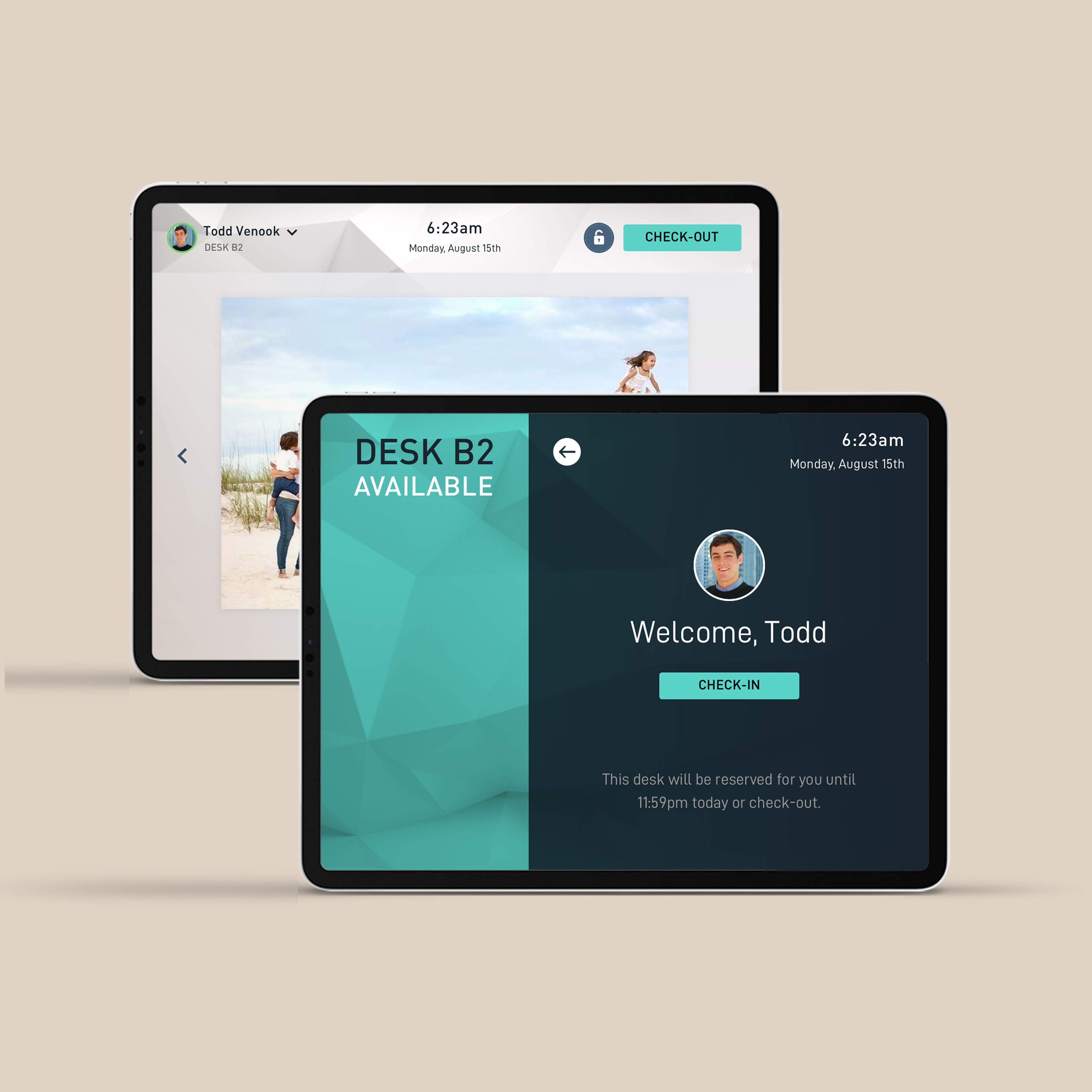
Working with the Fortune 500 company BCG, I lead a team to research and design the world's first multi-platform corporate desk & room reservation system. The contextual Bluetooth proximity technologies paired with iPads on each desk allowed staff to interact with multiple digital elements connecting their building, company directories, and coworkers. This experience can be seen in-person at the new Hudson Yards complex in New York City.
The Boston Consulting Group (BCG) is an American worldwide management consulting firm with 85 offices in 48 countries. The firm advises clients in the private, public, and non-profit sectors around the world.

BCG came looking to build a comprehensive and feature packed office assistant app. Fleshing out a rough concept already in play, my team was asked to design a massive multi-component application, including a feed-based community board (similar to the Facebook feed), customizable staff profiles, group chat, dynamic company calendar system for events & notifications, and lastly a proximity desk check-in feature in tandem with a companion desk kiosk app.
The application concepts already provided some underlying architecture, so the first major step was to assess these assets and integrate our new features. Understanding how to optimize this product launch was key for both our agency and the client due to tight time and resources allocated for the new feature sets.

As a first step our team went on-site to diagnose key bottlenecks and pain points from the staff’s perspective. This immediately allowed us to prioritize key userflows which would directly affect the majority of BCG employees. Taking this data and presenting it to the client was our next hurdle. Convincing clients of the appropriate design direction and product roadmap usually leads to revealing stakeholder’s emotionally driven biases and sensitivities. Presenting data-driven metrics helps clients to overcome some of these irrational product decisions, eventually leading to build a better experience for end users. This also helped to align all working teams on the main product goals during concept refinement.
Taking what we learned from on-site visits and user interviews, the app’s features started to become visible and a prioritized product roadmap clear. The main goal was to create a clean and simple interface for both the desk kiosk and mobile app. Allow users to see what desks are available, reserve, and check-into them. Secondary to this, staff members should have the ability to chat with other members currently in office, using location and proximity variables.

Escalation of time and budget can occur when designing any multi-platform app, and striving for a seamless experience no matter of controlled or uncontrolled external variables can be nightmarish. Common problems which arise include anything from environmental Bluetooth problems, network connectivity issues, even iOS notifications confusing users as to which notifications are most critical. All of these factors need to be addressed in the roadmap before implementation to save from delaying the release schedule.
After a beta release, two weeks of user-testing, and product refinement, the app went live. The new BCG Hudson Yards space is now digitally connected to accommodate 7,000 BCG employees which will fill the space over the next 5 years.