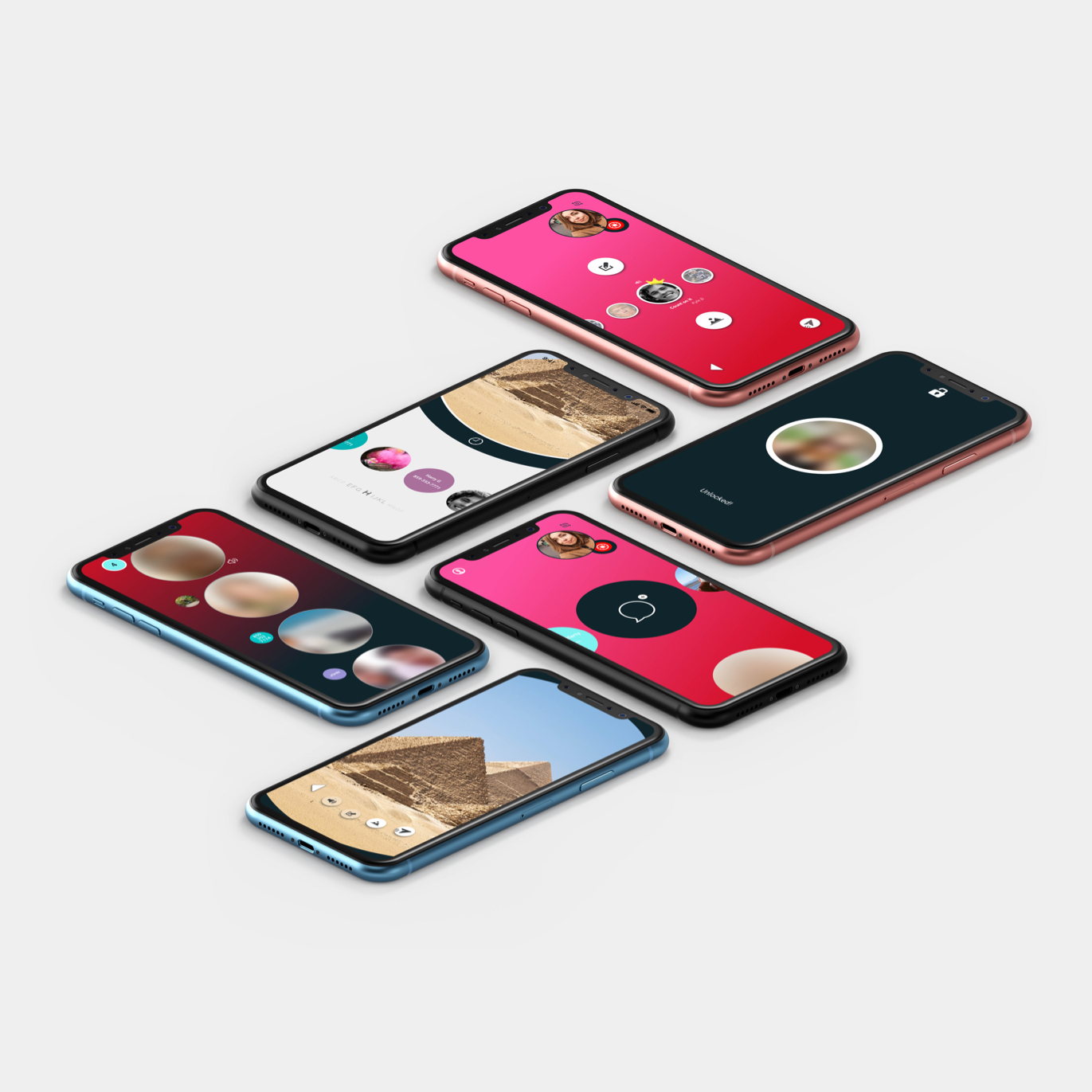
A huge client ask, design the next big ephemeral messaging application to dethrone the likes of Snapchat, Instagram and Telegram. Limited to a small 2 person execution team, we crafted and validated an entirely new type of messaging application for the upcoming iPhone X.

With new features like Face-ID message-lock security, everpresent camera for insta capture, and a one of a kind audio emoticon feature, we had a lot of unique experiences to validate. Through early client discovery sessions (where goals, expectations, and most importantly vision is set) we understood that to breakthrough the over-saturated market of messaging applications, our design needed to stand out. Not only did the interface need to be unique, but our MVP feature set must offer something unique and unobtainable by other current messaging options. It's a gamble when creating such radical feature sets, many users may not understand how to use said functions, or worse not value them at all. To maintain confidence in our product direction and prototype we conducted a series of user interviews. The results from these tests led us to a few revelations that would ensure our new type of UI was easy to understand and memorable. This extensive user testing was invaluable.

When designing specific consumer applications it can always be a bit tricky to ride the line between memorable and annoying. Most high touch-point apps need to build a growing base of return users, this can be extremely difficult as most users decide to drop off around the 30 day mark. I lead my team to understand the importance of instilling the “hook model” for MVP and early adopters. Our hook would be associated to “surprise and delight” content changes in the audio emoticon feature. Releasing new content weekly and changing the way users could message their friends would be a strong motivational cue to bring users back each week and drive re-engagement.
